

You're on a booking page, the traveller is tired, the flight from Heathrow has just landed, and the next decision needs to be simple. They don't want a brand story, a design award, or a dense wall of options. They want to know which transfer gets them to the cruise port, how much it costs, when it leaves, and what happens if their flight is late.
That's where user interface design earns its keep. In travel and booking products, the interface is the part that turns intent into a confirmed booking, one tap, one field, one step at a time. If the screen is confusing, even a strong service loses momentum. If the screen is clear, the traveller feels the product is reliable before they've even paid.
Table of Contents
- What User Interface Design Really Means for Booking Platforms
- The Building Blocks Every Booking Interface Shares
- How a Booking Interface Gets Built From Research to Handoff
- Making Booking Interfaces Accessible Without Redesigning Everything
- Choosing UI Tools Without Locking Your Team Into One Vendor
- Testing Booking Interfaces With the Metrics That Actually Matter
- Designing for Older and First-Time Travellers on Booking Flows
- A Practical UI Checklist for Any Travel Booking Page
What User Interface Design Really Means for Booking Platforms
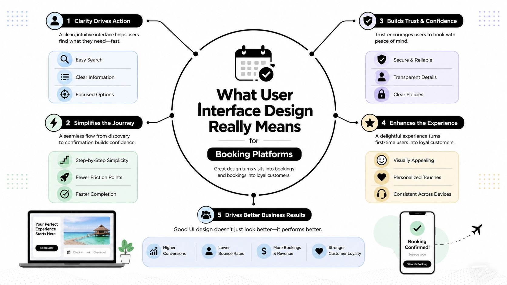
A tired traveller at Heathrow isn't thinking about interface theory. They're trying to book a transfer to Southampton without making a mistake, overpaying, or getting trapped in a five-page form that keeps them guessing. That's the true test of user interface design, because the UI is the visible layer where decisions become actions and actions become a booking.
UI is not the same as UX or branding
UI is the screen, the buttons, the labels, the spacing, the inputs, the state changes, and the order in which things appear. UX includes the wider journey, the research, the service model, and the emotional shape of the experience. Branding is the visual personality, colour, type, tone, and recognition. In a booking flow, those three overlap, but they are not the same job.
When teams blur the line, they argue about pixels when they should be arguing about flow. Should the traveller see return transfer options before passenger details? Should date and time live on one screen or two? Those are UI decisions because they determine how quickly a person can complete the task without friction.
Booking interfaces punish ambiguity
Travel booking is unforgiving because the user is under time pressure and usually making a practical choice, not browsing for fun. Every extra step adds doubt. Every unclear label creates an opportunity for abandonment. A screen that feels fine in a hallway demo can fall apart when someone is half-asleep on a phone with one hand on their suitcase.
That's why the interface has to answer concrete questions fast. What's included? Is this a private transfer or shared? Where do I enter my cruise terminal? What happens if my flight changes? A good UI handles those questions with structure, not with paragraphs of reassurance.
Practical rule: if a traveller can't tell what happens next by scanning the screen once, the interface is doing too much work in the wrong place.
For a booking platform, this discipline matters even more than in a content site, because the UI sits directly on top of revenue. The best interfaces reduce uncertainty, reduce effort, and keep the user moving forward. That's the core of the discipline, whether the booking is for a Heathrow hotel run, a cruise port transfer, or a last-minute airport pickup. For a related example of how live inventory and urgency can shape booking behaviour, look at this last-minute availability guide.
The Building Blocks Every Booking Interface Shares
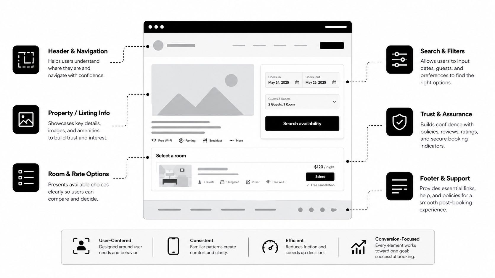
A strong booking screen rarely feels complicated when it's well built. That's because the same four building blocks keep showing up underneath the polish. If you understand them, you can look at almost any transfer form and name what you're seeing without guessing.
Visual hierarchy tells the eye where to go first
The first job is to decide what the traveller should notice before anything else. On a Heathrow-to-Southampton transfer page, that might be the route name, the date picker, the vehicle type, or the primary booking button. Hierarchy is created through size, weight, spacing, colour, and placement, not through decoration.
If the total price is important, it shouldn't sit below a block of marketing copy. If the departure date is the key filter, it needs to be obvious before the user starts scrolling. Hierarchy is not about making everything loud. It's about making the right thing loud and the rest quiet.
Components keep the interface repeatable
Booking interfaces lean on reusable components because the same patterns appear again and again. A date picker, a passenger count selector, a fare card, a primary call-to-action, an address field, a pickup time selector, all of these should behave consistently across the product. That consistency matters because travellers learn the pattern once and carry it through the flow.
If your team uses the same fare card in search results and checkout, the user doesn't need to relearn the meaning of the layout. If the button colour, label style, and spacing shift from page to page, the interface feels improvised. That's when people hesitate.
States are where real usability shows up
A component on its own isn't enough. You also need to think about interaction states, default, hover, focus, error, success, and disabled. A form field that looks fine when empty may become confusing when it rejects a postcode or shows a missing flight number.
Many booking interfaces fail in practice. The UI works in the designer's mockup, then the user types something unexpected, and the screen doesn't explain what happened. A good state system makes the product feel calm when something goes wrong.
Layout grids hold the whole thing together
The grid is the invisible structure that keeps mobile and desktop aligned. Without it, you get drifting buttons, uneven cards, and forms that feel cramped on one device and too spread out on another. With it, the booking flow feels deliberate, even when the content changes.
Here's the simple test: if you can move from a search result card to the booking form without the interface losing its rhythm, the layout system is doing its job. If the screen keeps jumping, the traveller feels that instability immediately. That's why the grid is not a background detail, it's part of the product logic.
| Element | What it does on a Heathrow-to-port booking screen | What to check |
|---|---|---|
| Visual hierarchy | Guides the user to route, date, price, and checkout | The first scan should match the user's main task |
| Components | Reuses date pickers, fare cards, and buttons | Each component should behave the same way every time |
| States | Shows errors, focus, success, and disabled actions | Every state should explain what changed |
| Layout grid | Keeps the page aligned across devices | Mobile and desktop should feel like one system |
How a Booking Interface Gets Built From Research to Handoff
A booking interface rarely arrives as a finished picture. It is assembled in stages, and each stage removes a different layer of uncertainty. If a team skips that progression, the result can look polished while the booking logic underneath still feels shaky to travellers.
Start with research and journey mapping
The first artefacts are usually plain, not polished. Teams collect support tickets, traveller questions, search intent, and the friction points that keep showing up in the booking flow. Then they map the journey, landing page, route selection, date and time, passenger details, extras, payment, confirmation.
For a Heathrow-to-cruise-port transfer, the questions are practical and specific. Is the transfer private or shared? Can the driver wait if the flight is delayed? Where does the traveller meet the driver? Research tells the team which doubts need answers on screen, and which can stay in support content or later steps.
Move that into information architecture and wireframes
Once the questions are clear, the team shapes the structure. That means deciding what belongs on each screen and what should stay hidden until the user needs it. Low-fidelity wireframes help because they force everyone to focus on sequence instead of colour, type, or polish.
A wireframe for this booking might place the route summary at the top, the booking panel in the middle, and reassurance details near the action button. At this stage, the work is flow diagrams, wireframes, and notes about what each page has to do. The team should already be able to trace how a traveller moves from intent to payment without guessing.
Finish with mockups, tokens, and handoff notes
High-fidelity mockups bring in the visual system, typography, colour, spacing, and component styling. Then engineering handoff turns those mockups into buildable instructions. That usually includes design tokens, component specs, state annotations, and clear notes about edge cases.
A weak process shows up when a small team jumps from a polished mockup straight into code. It feels fast at first, but it usually means error states, empty states, and accessibility details get patched later. That is expensive, and in booking flows it creates risk because the missing states tend to appear exactly where payment and trust are on the line.
A booking UI is only as strong as its worst state.
The mobile tracking example shows why context matters. The interface has to support different devices and different trip situations without losing sight of the same core task.
Making Booking Interfaces Accessible Without Redesigning Everything
A Heathrow-to-cruise-port transfer page can look polished and still fail people the moment they try to use it with a keyboard, a screen reader, or tired eyes after a long flight. Accessibility work is often about clearing the friction that already exists in the booking flow, not rebuilding the whole interface from scratch. In the UK, service providers are expected to make digital services usable for disabled people, and public guidance has pushed teams toward WCAG-based practice. The Office for National Statistics has reported that a large share of the population has a disability, so contrast, focus states, labels, and screen-reader support affect more travellers than many teams assume. UK accessibility and disability context
Fix the most visible friction first
Start with the parts of the booking screen that carry the most pressure. On a transfer page, that usually means the route summary, the fare, and the button that moves the traveller into payment. The main call-to-action should stand out clearly, because users need to spot it without hunting across the page. Interactive elements should show a visible focus ring, because keyboard users need to know exactly where they are.
Labels need to sit with inputs, not float nearby and hope for the best. A field for flight number, pickup time, or cruise port details should make sense on its own, even if the rest of the page is hidden from view by assistive tech. Error messages deserve the same care. If a traveller enters the wrong postcode or leaves out a flight number, the message should appear next to the field, explain the problem in plain language, and point them toward the fix. A toast buried at the top of the page will not help when the user is already focused on the checkout form.
Make the tab order and reading order match the screen
Keyboard navigation is one of the easiest accessibility checks to miss. If the tab order jumps around the page, the user loses context fast, and a simple booking becomes a string of guesses. In a Heathrow-to-cruise-port flow, that can mean moving from the route selector to passenger details, then suddenly landing on a footer link before reaching the payment step.
The screen should move in the same order the eye expects. Route details, date, time, passenger details, extras, payment, confirmation. If the visual sequence and the keyboard sequence disagree, users with assistive tech feel that mismatch immediately. It works like reading a form that has been shuffled. The labels may still be there, but the path no longer makes sense.
Use a quick checklist before you ship
Run this check against any live booking page in under 30 minutes.
- Colour contrast: confirm the main action, price text, and field labels are readable in all states.
- Keyboard access: tab through every control and make sure nothing traps the user.
- Field labels: verify each input has a clear label and a meaningful helper line where needed.
- Error recovery: test a bad postcode, a missing date, and a failed payment step.
- Focus visibility: make sure the active element is always obvious.
- Responsive flow: shrink the page to mobile width and confirm nothing hides or breaks.
That checklist is small on purpose. It catches the problems that show up most often in travel booking, where a customer may be on mobile, in a rush, and relying on the screen to tell them what to do next. The mobile tracking example is a useful reminder that trust features should support the booking task, not compete with it.
Choosing UI Tools Without Locking Your Team Into One Vendor
A booking screen for a Heathrow-to-cruise-port transfer can look polished in the mockup and still fail in handoff. The menu may help a designer move quickly, but the key question is whether the tool helps the team test the flow, reuse patterns, and keep the booking page consistent after launch. For a small travel business, the best stack is the one that supports those steps without forcing extra work on every screen.
Group the tools by job
Design and prototyping tools support early exploration and stakeholder review. Code component libraries support implementation, consistency, and accessibility patterns. Testing and analytics tools show whether the booking flow still works once real travellers start using it.
That split keeps the team grounded. Figma or a similar tool helps shape the screen and compare ideas. A component system lets engineering ship the same pattern again without rebuilding every control. Testing tools show whether the booking page helps people finish the task or whether they stall on the way to payment.
| Category | Primary use | Best booking-flow stage | Watch out for |
|---|---|---|---|
| Design and prototyping tools | Sketching screens and reviewing ideas | Research, wireframes, mockups | Pretty concepts that never get tested |
| Code component libraries | Reusable UI patterns with implementation rules | Build, handoff, production | Over-customising and breaking consistency |
| Testing and analytics platforms | Watching user behaviour and friction | Post-launch optimisation | Tracking vanity metrics instead of flow metrics |
Pick systems that already solve common interface problems
Booking products benefit from mature UI systems because they reduce repeat work. Material, Apple's Human Interface Guidelines, Radix, and the GOV.UK Design System all give teams a starting point for layout, controls, and accessibility patterns. Even if your team is building a commercial travel product, public-sector style guides can still be useful references because they prioritise clarity and task completion.
That matters when one interface has to serve desktop planners and mobile travellers at the same time. A system with strong defaults keeps each screen from becoming a one-off decision. It also makes engineering handoff cleaner, because the team is building from patterns instead of from isolated artwork. The mobile tracking example is a good reminder that support features should sit around the booking task, not compete with it.
Don't let the tool dictate the product
The wrong stack can make a team overconfident. A polished canvas can hide weak flow logic. A code library can make the interface look consistent while the booking steps still confuse people. Tools should support the product decisions, not replace them.
The EC Minibus route page shows that the booking surface should follow the user's journey, not the tool vendor's preferences.
Testing Booking Interfaces With the Metrics That Actually Matter
A booking page can look polished and still fail travelers at the point that matters most. A Heathrow-to-cruise-port transfer flow might attract clicks, yet still lose people at the date screen, the passenger details step, or the payment page. Pageviews only prove that someone showed up. They do not show whether the interface helped them finish the task, which is the true test for a travel booking flow.
Tie each metric to a screen decision
Each metric should point back to a specific screen decision. If travellers drop off on the date screen, the date picker may be doing too much work or asking for more input than people expect. If checkout fails often, the error handling or payment layout may be unclear. If mobile completion lags behind desktop, the form may be too dense, the tap targets too small, or the hierarchy too hard to scan on a phone held in one hand.
That is how interface choices become measurable. A booking screen with too many steps creates more chances for abandonment. A clear call to action on a high-contrast button can improve clicks because it helps users see what to do next. Those are not abstract ideas once you connect them to the booking events your team can observe in production.
Use quick tests before you start redesigning
A live booking page does not need a large research programme before it reveals problems. Five moderated tests can show whether users understand the flow, spot the main action, and recover after an error. Give them one realistic task, such as booking a Heathrow-to-cruise-port transfer for a cruise departure, and watch where they hesitate, where they guess, and where they stop trusting the page.
Pair that with basic analytics events on the booking steps. Track when users reach each stage, when they correct a field, and when they leave. A heavy instrumentation setup is not required to learn something useful. A clear question and a clear event trail are enough to show where the interface is helping and where it is getting in the way.
Measure the funnel, not the wallpaper
The useful metrics are the ones that change product decisions:
- Task completion rate tells you whether users are finishing the booking.
- Time to first successful booking tells you whether the flow is hard to learn.
- Error recovery rate tells you whether the interface explains failure clearly enough.
- Mobile versus desktop gap tells you where touch design or layout is falling behind.
- Abandonment by step tells you which screen needs redesign first.
If a form has to be shortened, start with the step that loses the most people. If a CTA is being missed, check contrast and placement before you rework the whole page. The customer loyalty flow example is a reminder that retention starts with a booking experience people can finish without effort.
Designing for Older and First-Time Travellers on Booking Flows
A lot of interfaces are built for confident, repeat users. That's a mistake in travel, where many customers are booking under stress, on the move, or on a device they don't fully trust. Older adults and first-time travellers often need more reassurance, not more cleverness.
Start with the real UK digital context
UK digital inclusion isn't even across all groups. Ofcom reports that older adults and lower-income groups are less likely to be confident or active online than the general population. That means a booking page that assumes fast self-service and perfect familiarity will exclude people who still want to travel, book, and pay online. Digital inclusion and inclusion-aware design guidance
The practical response is not to overload the page with help text. It's to lower the cognitive burden. Use plain language, keep choices grouped, and make the next step obvious without forcing the user to parse too much.
Design for reassurance, not just efficiency
Large tap targets help, especially on phones used one-handed. Plain-language summaries next to jargon prevent confusion around terms like meet-and-greet, private transfer, or terminal pickup. A visible phone number or live chat link gives the user a human fallback when they hesitate.
Error states matter even more here. If something goes wrong, don't just mark the field in red. Show what failed and how to fix it. If the traveller entered an invalid date, tell them what format to use or provide a picker again. If the payment fails, explain the next action clearly.
Don't make voice the primary answer
Voice and conversational UI have a role, but they're not a reliable default for every traveller. Research on older and low-income users highlights recurring problems with learning new technology and with voice interfaces in real-world conditions. That means conversational support should be optional, not mandatory, especially for stressed users trying to complete a time-sensitive booking. Older adults and low-income user interface research
The best interface for an older traveller is usually the one that feels obvious, not the one that feels impressive.
A better booking screen gives people choice without forcing them to learn a new interaction model. That's why the safest pattern is still a clear form, obvious labels, visible support, and an easy way back when they make a mistake.
A Practical UI Checklist for Any Travel Booking Page
If you only keep one working note from all of this, keep a checklist. Booking interfaces get better when the team applies the same standards every time, not when each page is redesigned from scratch. The goal is to make the screen easy to scan, hard to misuse, and simple to complete.
Use this before launch and after every major change
- One dominant action per screen: the traveller should always know what to do next.
- Three to four steps, not a maze: keep the booking flow short enough to hold in working memory.
- Contrast checked against WCAG: make the main action and key text easy to see.
- Focus rings visible: keyboard users should never lose their place.
- Large tap targets: mobile travellers need buttons they can hit without precision.
- Transparent pricing before payment: no one likes surprises at checkout.
- Meet-and-greet confirmation with a real photo and licence badge: reassurance should be visible, not buried.
- Human fallback on every screen: phone, live chat, or support should be easy to find.
The strongest booking pages do one more thing well. They keep the trade-offs clear. As AI-driven personalisation matures, the interface job shifts away from listing options and towards explaining the consequences of each choice. That's where the next wave of travel UI work will happen, because travellers won't need more noise. They'll need better judgement, shown clearly on the screen.
If you're building or refreshing a Heathrow, cruise port, or hotel transfer flow, EC Minibus shows what a practical booking experience should feel like, clear steps, transparent details, and support when travellers need it. Visit EC Minibus to see how a travel booking service can keep the interface simple while still handling the practical details that matter.